Introducing Design Tokens
Revamped UI Kit colors for dark-mode support and granular customizations
Product Background
The core product of social.plus is our UI Kit — a white-label solution that enables clients to rapidly build their own social communities. This flexibility meant clients often needed customization capabilities to align the UI with their brand identities.
However, the existing color system — a fundamental part of the design foundation — wasn’t built to support customization at a granular level. This project focused on modernizing the legacy color system by adopting an industry practice: design tokens.
Team
- Keawalee Chantawong, Product Design Team Lead
- Alin Saenchaichana, Product Designer (Me)
- AJ Supanat Pinyo, Product Design Intern
My Role
I initiated the project by highlighting the limitations of the existing color system and advocating for change. From there, I led the research and restructuring of our color tokens, including their architecture, shading logics, and customization POC.
Year
2025
Challenges with the Legacy Color System
No Contextual Mapping
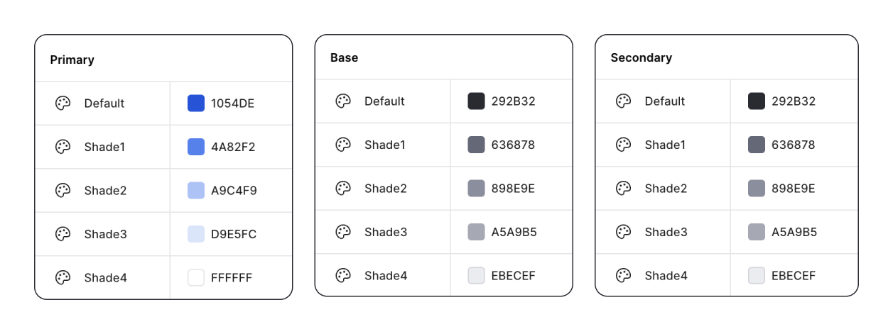
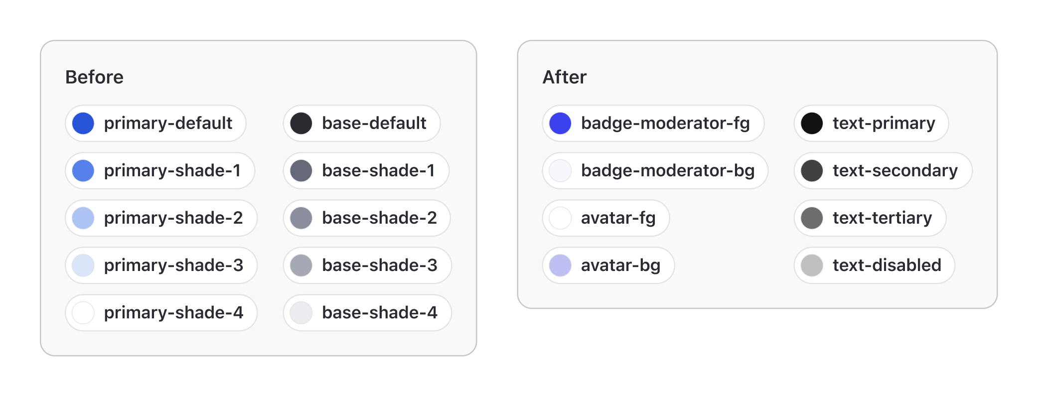
Colors were grouped into Primary, Base, and Secondary, each with 5 arbitrary shades (Default, Shade 1–4). There was no contextual mapping of colors to components, making it difficult for clients to predict how a color change would affect their UI. Clients customizing the UI kit often voiced frustration, saying they didn’t know which variable controlled which parts of the UI.
Dark Mode was Nearly Impossible
Because the palette was so limited, components with completely different purposes were tied to the same color variables. This looked acceptable in light mode, but once switched to dark mode, accessibility broke down.
For example, the disabled 'Post' button and the avatar background both used primary-shade-2. Adjusting primary-shade-2 in dark mode to make the button appear disabled also unintentionally changed the avatar background color — an unavoidable conflict.
Project Objectives
- Redesign the token architecture to provide clear organization and flexibility for commonly customized components
- Make customization predictable
- Lay a scalable foundation for light/dark mode
Understanding How Our Clients and Prospect Would Use the UI Kit
I researched how our clients currently modified our UI Kit and studied how larger design teams — comparable in scale to our customer base — structured their design systems and tokens. Here are 3 key insights that guided our new token architecture:
Every Company Relies on a Set of Common Components
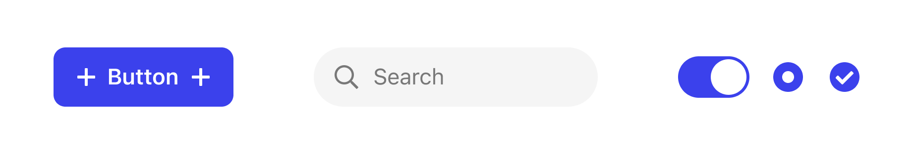
Foundational components serve as the face of a product’s brand, meaning clients almost always wanted to apply their own brand colors and interaction states. Our tokens needed to make customizing these entry-point components intuitive, isolated, and predictable.
Control Over Text Colors Is Essential
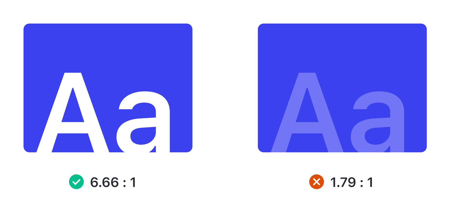
A significant portion of our clients and prospects are U.S.-based, which means their UIs must meet accessibility requirements under the Americans with Disabilities Act (ADA). For us, this translated into designing tokens with the flexibility and granularity needed to maintain proper contrast ratios across both light and dark modes. Without this level of control, even a simple adjustment — like changing a heading color — could unintentionally break accessibility and compromise compliance.
Feature-Specific Components Require Dedicated Tokens
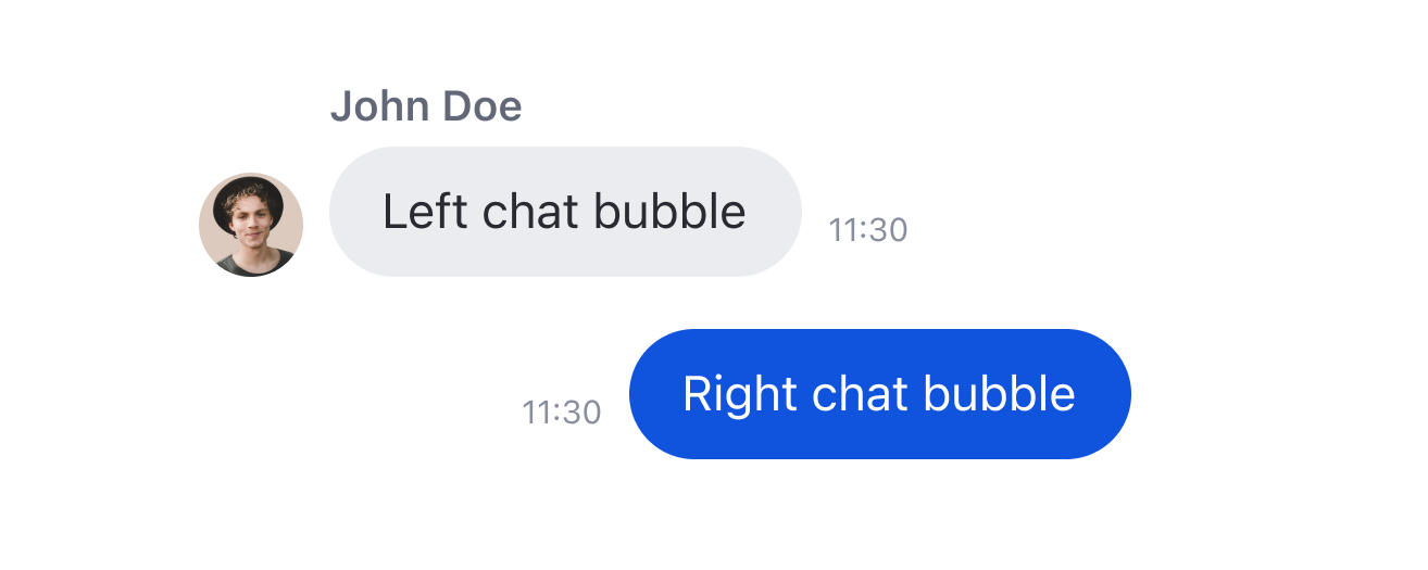
As our UI Kit introduced new features into clients’ products, it also brought along new components such as moderator badges, story rings, comment cards, and chat bubbles. Unlike standard elements, these were the components most likely to diverge from the defaults that clients typically had and used. They were often themed independently — sometimes completely disconnected from the brand’s global palette — making it essential to provide dedicated tokens for these feature-specific components.
Setting Up the Tokens
Based on our findings, we categorized our color tokens into 2 groups:
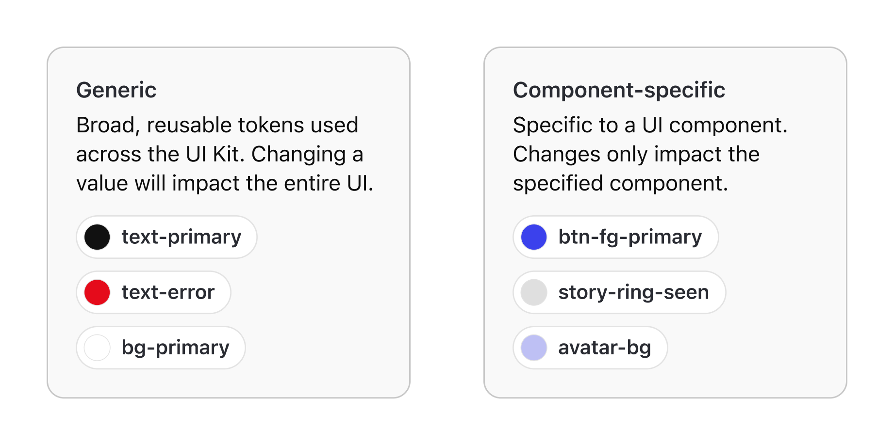
1. Generic Tokens
Foundational tokens for colors that define universal values (e.g., bg-primary, text-primary, border-error). These ensured consistency and accessibility across the UI.
2. Component-Specific Tokens
These tokens mapped directly to specific UI components (e.g., avatar-bg, avatar-fg, bubble-chat-left-bg). This gave clients the ability to theme individual features without affecting the rest of the system.
Semantic Token Naming Convention
To ensure our tokens are consistent, scalable, and easy to understand, we established a structured naming pattern:
[component]-[property]-[context]-[variant]_[modifier]
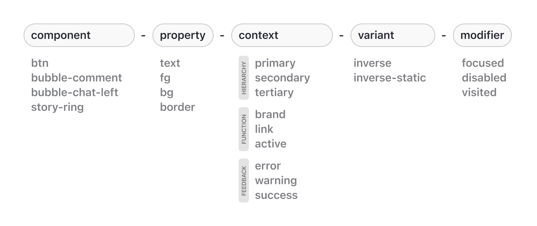
Breakdown of the Structure
- Component → Identifies the specific component the token applies to (e.g.,
avatar,btn). - Property → Defines the design area of usage (e.g.,
text,bg,border,fg). - Context → Specifies the role or hierarchy of the token (e.g.,
primary,link,error). - Variant → Captures conditions tied to theming or background usage (e.g.,
inverse,inverse-static). - Modifier → Adds nuance for interaction states or conditions (e.g.,
disabled,focused,visted).
Flexible, Not Rigid
Not every token needs all of these elements. For example, text-primary-inverse-static doesn’t require a component or modifier. But outlining the full structure ensures that when complexity arises, we already have a consistent framework to scale into.
This convention gives our tokens:
- Clarity → Anyone can read a token name and immediately understand its purpose.
- Scalability → New roles, states, or components can be added without breaking the system.
- Consistency → Designers and developers share the same mental model when referencing tokens.
Built Truly for Customization
One principle we embraced while building the new token architecture was: design for flexibility, not just for defaults.
Even if a component didn’t actively use a certain property in its default style, we still provided a dedicated token for it and tied it to the component.
For example, our text fields don’t use visible borders by default. However, we still introduced a boxed-input-border token, with its default value set to #FFFFFF 0% (transparent).
This meant that if a client wanted to introduce a border style for their brand, they could do so directly through the tokens — without needing overrides.
Learnings & Results
This project highlight the importance of designing not just for today’s needs, but for how the company can client can scale and evolve their products.
Predictable Customization
Token systems work best when contextual and human-readable, so designers and developers alike can predict outcomes. Clients can also now theme their UIs with confidence, knowing which tokens affect which components.
Accessibility by Design
Accessibility must be embedded into the foundation, not added later. Contrast compliance became easier to maintain with dedicated text tokens.
Dark Mode Support
By separating tokens by intent and usage, components are no longer forced to share the same color values. A disabled button and an avatar background can now each map to their own semantic tokens, preserving their distinct roles in both light and dark themes.
Future-Proof Foundation
A single token set can’t cover both universal and feature-specific needs — separation is essential. This structure avoids conflicts, supports feature growth, and extends naturally to future non-color customizations like corner radius or spacing.
Next Steps
This case study covered Part 1 of the color revamp — semantic tokens tied directly to UI components. Semantic tokens give clients the depth and control they need for advanced customization.
But for simpler use cases — like inputting a single brand color and having it cascade across the entire UI — we needed a more foundational layer, primitive tokens underlying semantic tokens
Part 2 explores how we defined these primitive tokens, from the ground up, including our approach to color foundations and shading logic. Read part 2