From Boring to Brilliant
Turned inevitable AI wait times into a meaningful experience
Product Background
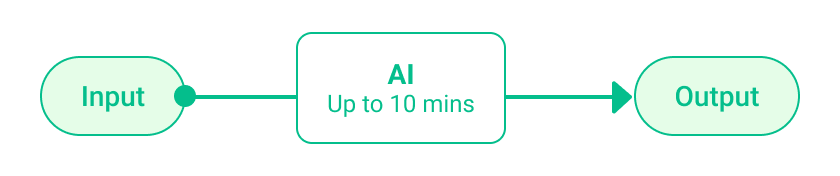
social.plus (formerly Amity Technologies) has been leveraging AI technology to help customers understand their users like never before. The GPT-powered conversational research tool analyzes users’ posts to generate detailed reports.
However, the AI processing time could take up to 10 minutes. That’s a long wait for users and where I came in to create a positive waiting experience.
Disclaimer: This project had been put on hold.
Team
- Trust Ratch, Head of SDK Engineering
- Nutchaphon Rewik, Senior Architect
- Kan Eksombatchai, Product Manager
- Alin Saenchaichana, Product Designer (Me)
My Role
Responsible for the entire design process from research to hand off. Collaborated with the development team to ensure technical feasibility.
Design Timeline
5 Days
Year
2024
The Problem
Challenge to solve
User would be have an idle waiting time ranging from 5 to 10 minutes while the AI processed large volumes of social media posts. Leaving this unavoidable delay unaddressed could create uncertainty about processing status, increase perceived wait time, and lead to user frustration.
Goals
- Increase transparency about the processing status
- Improve overall user experience and satisfaction
The Journey
Understanding the constraints
I began by researching and analyzing the loading states of AI-powered tools like ChatGPT, Perplexity, and Claude. However, these products differed significantly from our system:
- Their processing times are much shorter.
- They stream output gradually, providing continuous feedback during the process.
In our case, the AI needed to finish the entire process before showing any results, so gradually streaming output wasn’t an option.
Exploring solutions to reduce perceived wait time
I turned to another domain where users regularly experience longer load times–gaming. They typically use 3 types of loading screens:
- Animations with text, like The Sims.
- Animations without text, like Assassin’s Creed, where the character moves in loop.
- Interactive mini-games, like FIFA, where you can actually practice.

While interactive animations are the best at keeping users distracted, they were not feasible for our timeline. Between animations with text and without text, a study on loading animations (source: ResearchGate) showed that:
- Users actively search for more information when animations are repetitive.
- Adding elements like progress bars or dynamic text reduces frustration and makes the wait feel shorter.
Prototyping the idea
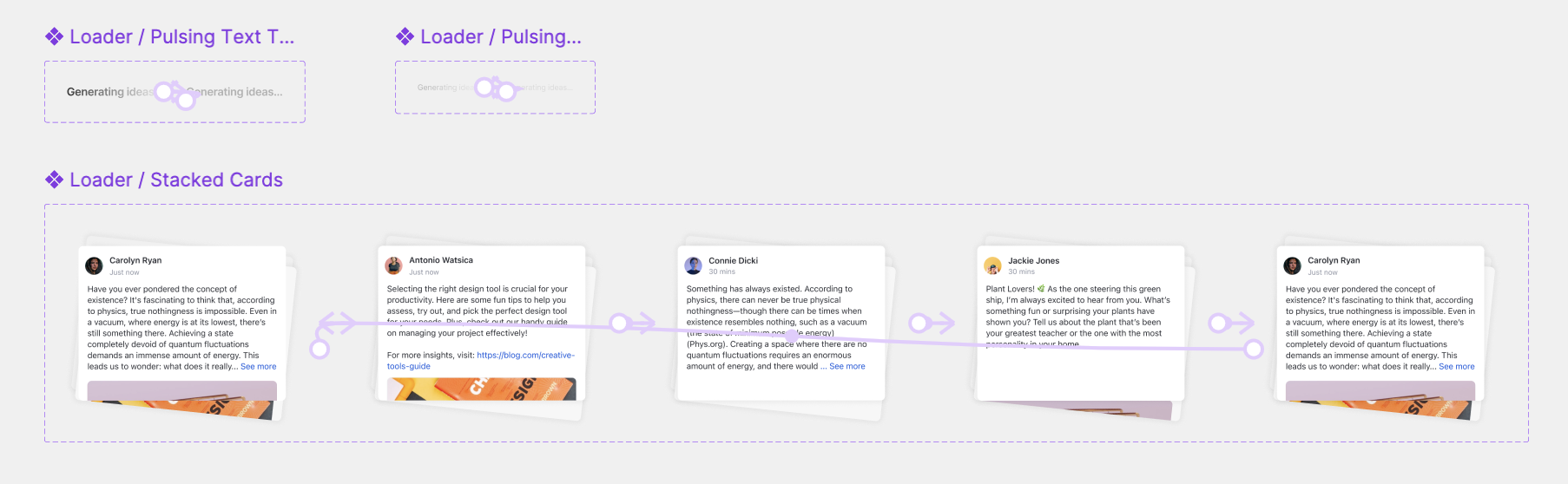
True that we couldn’t show the output of AI until the whole process was done. But, we knew exactly what were the inputs. So, the idea was to show posts that were being processed as animation.
The Solution
Rather than letting the loading screen be a passive experience, I approached it as an opportunity to enhance the user’s interaction with the product.
Give users a visual sense of the work happening in the background
- Break the entire process into smaller chunks
Smaller steps are not only perceived as faster, but they also mimic the AI’s processing steps, creating a connection between the waiting time and the task being performed. - Animate sample posts that are being analyzed
Users could see the real content being processed, offering a glimpse into the data the system was working with.
Don’t just fill time, but also add value
- Make user feels comfortable to step away from the screen
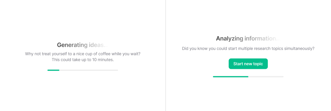
In 2024, many users were still new to AI tools and didn’t always realize that the process would keep running in the background. To address this, I used a friendly copy like “Why not treat yourself to a nice cup of coffee while you wait?. This could take up to 10 minutes.” to communicate with users that they could safely leave the screen and return later. - Help user discover and maximize product capabilities
Display tips like “Did you know you could start multiple research topics simultaneously?” These tips were designed to be short, easy to understand, ensuring they wouldn’t overwhelm users during their wait.
The Results
This approach transformed the unavoidable waiting time into a moment of value. Users didn’t just wait—they learned, stayed engaged, and gained confidence in the product’s capabilities.
Feedback
We tested this solution with group of roughly 30 users in our product demo session and were responded with positive feedback:
- "The loading screen is so cool—I actually look forward to it!"
- "I discovered a feature I didn't know existed while waiting for my reports."
- "Being able to see the posts being processed makes me more confident the system is working."
The Reflections
This project was a lesson in turning constraints into opportunities. Designing for a 10-minute wait time felt daunting at first, but it challenged me to think beyond conventional solutions and find ways to enhance the user experience during an otherwise frustrating moment.
Key takeaways
- How users perceive wait time is more about the experience in that moment than the actual duration
- Transparency about processes builds user trust
- Cross-functional collaboration was essential for balancing design ambition with technical feasibility
It’s not always about eliminating the problem but finding ways to turn it into a meaningful experience :-)