Image Poll Rollout
Boosted engagement with high impact delivery and minimal engineering effort
Product Background
Engagement is the heartbeat of any community. While existing poll posts already played a major role in driving interaction, they were limited to text-only options. Over time, we noticed users posting two images with captions and asking people to comment to vote — a clear sign that they wanted more expressive ways to interact.
Our goal was simple but challenging: bring visual engagement to polls while staying within tight timelines. The solution had to be built upon our current infrastructure — not against it. Still, it needs to deliver features clients expect — such as alt text accessibility, and viewing full images before and after voting.
Team
- Ishwar Varshney — Junior Product Manager
- Alin Saenchaichana — Product Designer (Me)
My Role
I collaborated with the Product Manager on researching the landscape and uncovering user expectations. Then, I led the design of the new image poll experience, focusing on minimizing new build requirements by reusing existing components and logics.
Design Timeline
10 days
Year
2025
Spotting the Gap in the Product
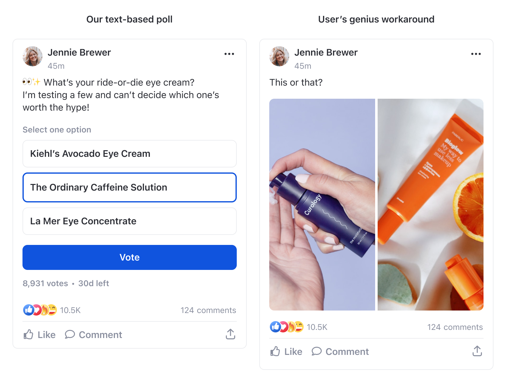
The original poll component only supported text-based options, which limited creative expression. Instead, users found a workaround — creating manual “image polls” using standard posts, which lacked real interaction (no voting, no results).
We knew this behavior meant high intent but low satisfaction. The challenge was to meet that user intent without a full rebuild of the poll system.
The Easiest Way Wouldn’t Meet Expectations
At first, we considered taking the simplest route. Looking at our existing poll creation flow, it seemed easy enough to support images by adding a small upload placeholder next to the text field — much like how Facebook handles image polls. This same idea could also extend to the voting and results screens without major structural changes.
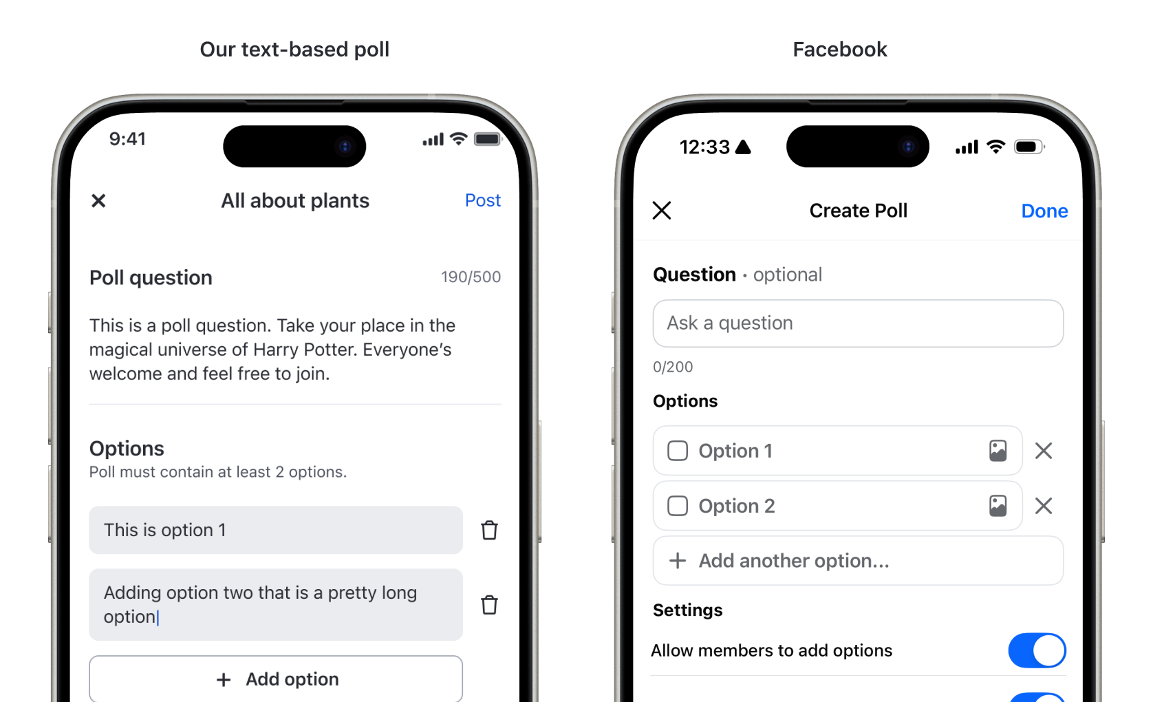
But as we refined the requirements and thought more deeply about user expectations, it became clear that this approach wouldn’t be enough.
When an image is uploaded, text should become optional.
Placing the text field first and giving it more visual emphasis suggests that text is mandatory while the image is secondary. In reality, we wanted the opposite — for images to take the spotlight, with text being optional.
Clients and users expect images to be large and engaging.
Image polls can be a strong marketing and engagement tool. To achieve that,images need to stand out — not sit as tiny thumbnails beside the text.
Users should be able to view images in full, both before and after voting.
Rendering images as small thumbnails on the side creates usability issues. The touch area becomes limited, making it difficult to distinguish between tapping to vote and tapping to view the image in full.
Reimagining Creation Flow UI
Setting user expectations
Adding an extra step to the creation flow might seem counterintuitive, but it was a worthwhile trade-off. The input conditions for options in text-only polls and image polls differ significantly, and their final renderings are not the same.
To make this distinction clear, I introduced a poll type selection step at the beginning of the flow — allowing users to choose upfront whether they want to create a text or image poll.
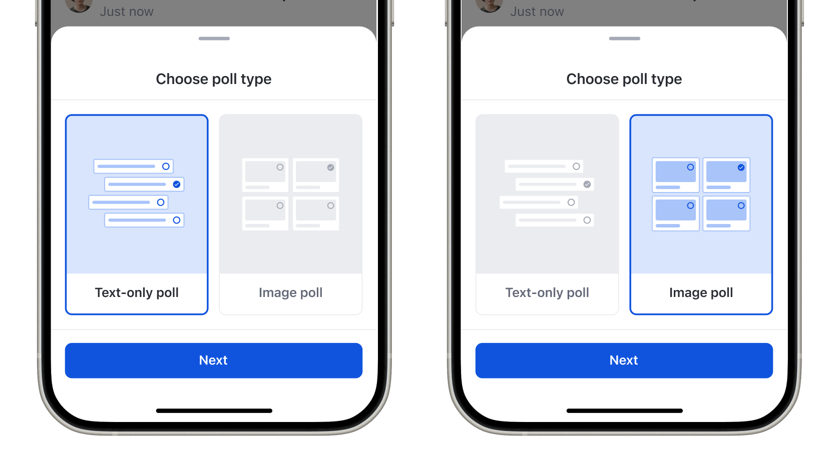
Each option features a visual preview: text polls are displayed as a list, while image polls are shown in a grid layout. This simple visual differentiation helps users immediately understand what the resulting poll will look like.
Reusing familiar interfaces
When breaking down what’s needed to create a poll, both types share the same core inputs — a question, multiple-selection toggle, and duration. The only difference lies in how options are structured.
To keep the experience consistent and minimize engineering effort, I reused all existing components from the text poll flow, except for the option input section. This ensured a familiar UX while keeping development light.
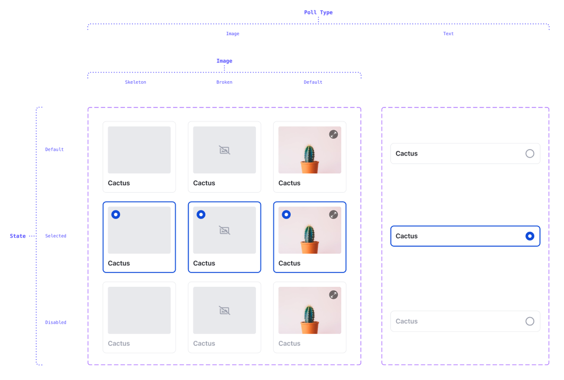
Supporting images and alternative text
For the option input, I introduced a 4:3 image placeholder — compact enough to work well in a grid layout while maintaining content visibility for portrait images set to aspect fill.
I also reused the existing image upload states and alt text input flow from the post creation page, grouping them together with a text field to form a single cohesive option input unit.
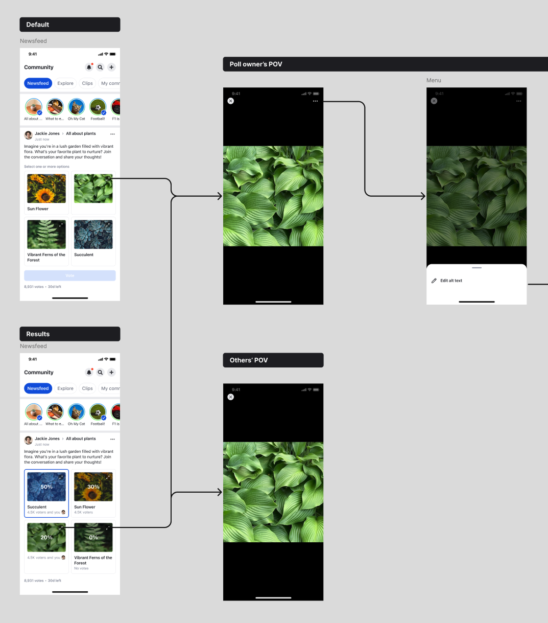
Designing Voting experience
Aligning with the text-only poll experience
I began by mapping out every interaction state from the text-only poll. The goal was not to reinvent, but to extend these states to support images seamlessly. This parity between image and text options kept the mental model consistent, making the new format feel instantly familiar to existing users.
Handling Result Visualization
Text polls relied on progress bars to visualize votes. For image polls, however, that approach added unnecessary clutter. Instead, we overlaid vote percentages directly on each image, using light contrast and background blur for legibility. This allowed the results to remain visually clean yet informative, highlighting the winning options without breaking the image grid’s balance.
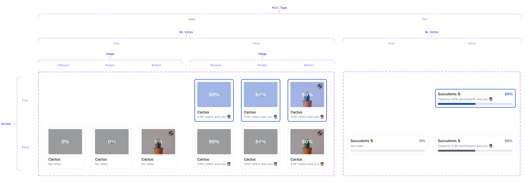
Viewing Full Images
Poll images can often be expressive or detail-heavy, so users needed a way to view them in full size without disrupting the poll layout. To achieve this, we introduced a “View Image” button positioned at the top-right corner of each option.
This placement ensures visibility and consistency — the button remains accessible across all states. When tapped, it opens the existing image viewer component already used in post creation and feed, keeping the experience lightweight and leveraging proven functionality.
Result
The new image-poll feature boosted engagement while staying lightweight. By reusing existing poll logic, the image-option component plugged directly into the current text-option flow — saving time on both development and QA.
Quick shout-out to @Alin for the awesome design work on our new image-poll feature. Easy plug-in. The image-option component plugs right into the existing text-option flow, letting us reuse most of the current UI and logic.
- Nakarin, Manager, SDK Engineering
Her components plug in so cleanly, even legacy code whispers ‘thank you.’
- Nutchaphon, Senior Director, Architect
She got a Rising Star Award for a reason.
- Trust, VP of Technology
The result was a feature that not only required minimal engineering effort, but also delivered the expressive experience users wanted.