In-App Notification Tray
Helped users catch up on important updates when they return to the app
Product Background
At social.plus, our social platform is embedded within a larger customer-facing app. While we rely on push notifications to engage users in real time, many choose to disable them. This means users often miss out on important updates while away from the app.
To solve this, we introduced a dedicated in-app notification tray—a place for users to easily catch up on relevant activity when they return, without needing push alerts.
Team
- Lindley Tam, Head of Product
- Alin Saenchaichana, Product Designer (Me)
My Role
I worked closely with the product manager to research, structure, and design the notification tray. My responsibilities included defining the notification types, designing the UI, and covering various edge cases—especially around navigation and notification logic.
Design Timeline
5 days
Goals
Create a structured in-app notification tray that allows users to:
- Quickly catch up on relevant activity
- Navigate directly to the source of the notification
- Identify new and unread updates
Laying the Foundation
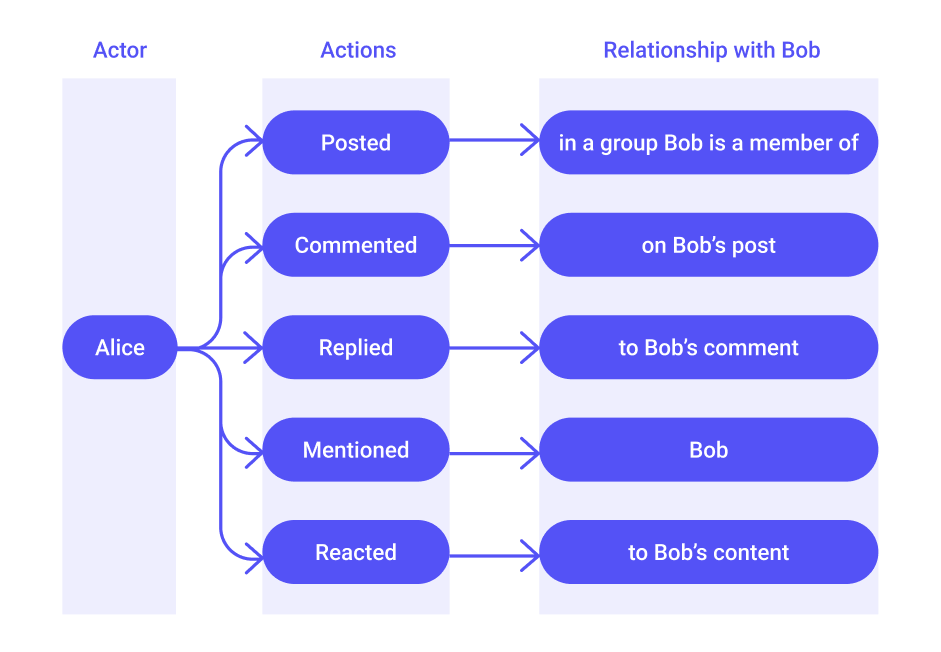
To make things easier to follow, we’ll walk through this from the perspective of a fictional user named Bob, a member of the Plant Lovers group.
Event Inventory
We began by identifying key events that should generate notifications, focusing on meaningful interactions between users and the groups they belong to. For Bob, these included:
- Posts – New posts created in groups Bob is part of
- Comments – New comments on Bob’s posts
- Replies – Responses to Bob’s comments
- Mentions – When someone mentions Bob in a post or comment
- Reactions – Likes or other reactions to Bob’s content
Event Prioritization
Some events can occur together. For example, if Alice creates a post and mentions Bob in it, triggering two notifications would be redundant.
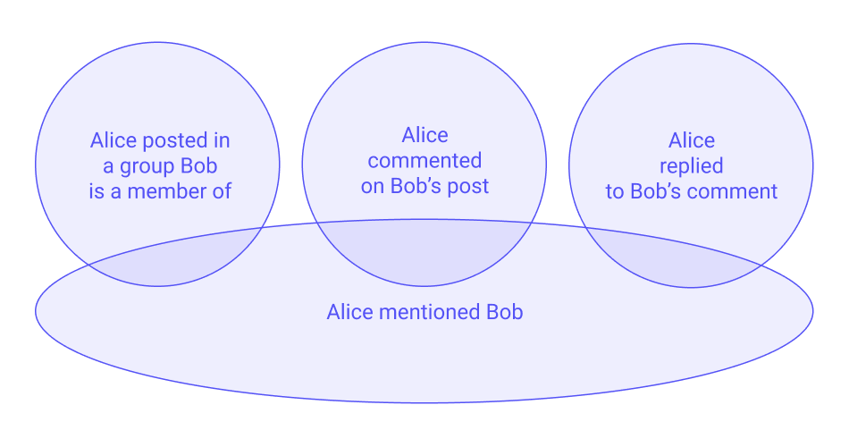
To reduce noise, we assigned priorities to events—mentions were given higher priority than posts, comments, or replies when they occurred together. This ensured Bob wouldn’t get multiple notifications for a single interaction.
Event Grouping
We explored grouping notifications to reduce clutter. Two key questions guided us:
- Which events should be grouped?
- What’s the right timeframe for grouping?
We decided to group post and reaction events, as they occur more frequently and tend to be less personal. Grouping helps reduce clutter while still keeping Bob informed. The rules we landed on:
- Events are grouped if they occur within a 24-hour window
- Grouping ends once Bob taps on the notification (marking it as read). Even if new events come in within the same 24-hour period, a new group will be created after the first group is read.
In contrast, comments, replies, and mentions are more personal and often carry more context. We chose not to group these so they remain individually visible—especially as we consider adding content previews in future iterations.
Touching Up the UX
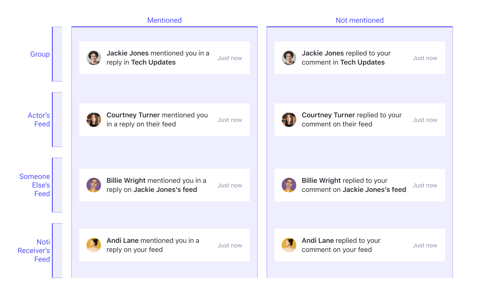
Choosing the Right Copy
We wrote each notification using a consistent Actor + Action + Object + Context pattern — for example, “Billie Wright replied to your comment on Jackie Jones’s feed.”
This consistency makes the list easy to scan vertically, since each message follows the same rhythm, and it keeps the Understanding clear even when users see multiple notifications at once. The “Context” element (e.g., “in Tech Updates” or “on your feed”) is especially important for infrequent visitors, as it helps them mentally place the interaction without needing to navigate further immediately.
We also chose to use the pronoun “their” when referring to another user’s content, to avoid assuming or misrepresenting anyone’s gender.
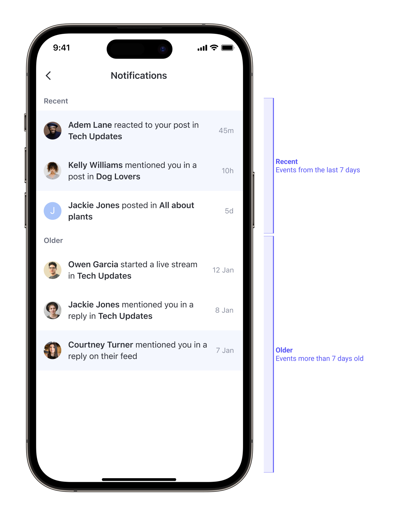
Sectioning the Tray
We noticed that many users don’t check the community every day. When they return, they often see a long list of updates—some still relevant, others outdated. Without structure, this list could feel overwhelming.
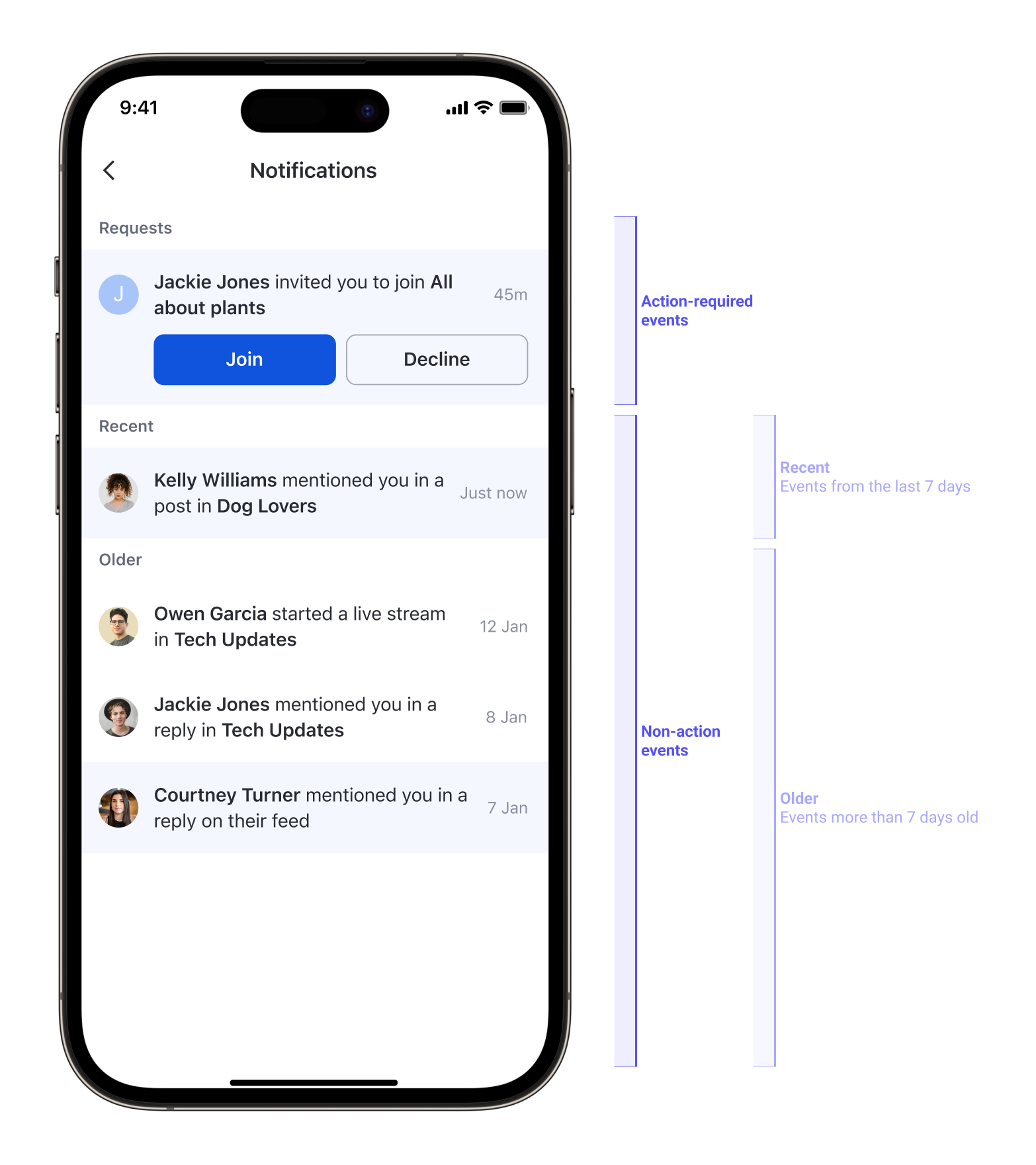
To make it easier to scan, we split the notification tray into 2 clear sections:
- Recent – Events from the last 7 days
- Older – Events more than 7 days old
This simple time-based split helps users focus on what’s new first. If a section has no events, it’s hidden so the tray stays clean and easy to read.
Covering Edge Cases
Handling Long Names & Text Overflow
We knew that some events—such as:
- “Alice posted in Plant Lovers”
- “Charlie posted in Plant Lovers”
—would always be grouped together. The question then became: How should we display a grouped event without losing important context?
Research into how other platforms handle this showed that some choose to truncate text after three lines. However, in cases where a user’s name is unusually long, this approach can cut off the most meaningful part of the notification, leaving it unclear.

After mocking and testing several truncation logics, we chose not to truncate at all. Instead, we limited the display to a maximum of two actor names. For example, “Charlie and Alice posted in Plant Lovers”
If more than two people are involved, the format becomes “David and 3 others posted in Plant Lovers”. This keeps notifications scannable while preserving key context.
Missing or Deleted Targets
The tray isn’t always updated in real time. At times, a notification may lead to content that’s been deleted or that the user no longer has permission to view. To avoid sending them to a blank screen, we designed a fallback page with a clear message—making the experience feel intentional rather than broken.
Empty Tray
Events expire after 90 days, so some users may open the tray and see nothing. We designed a dedicated empty state for this scenario and new users, so users understand that there are simply no notifications, rather than thinking the feature isn’t working
Building on Top
Introducing Actionable Event
Shortly after launching the notification tray, we introduced the feature group invitations, allowing moderators to invite users into their groups.
This introduced a new type of notification—one that required the user to take action. From here, we categorized events into 2 groups:
-
Action-required events, such as group invitations (with room to scale for future cases like follow requests).
-
Non-action events, such as posts, comments, replies, mentions, and reactions.
Incorporating New Events into the Tray
The actionable events were delivered through a new separate API, so from a technical standpoint, placing these events in their own section made implementation smoother for engineering.
From a UX perspective, separating these actionable notifications also offered clear benefits:
- Putting action-required events at the top ensures users don’t miss important tasks needing their attention.
- Without this separation, notifications from both categories would be interleaved by timestamp. If one API failed during a user’s visit, some notifications wouldn’t appear. Then, when the user returned later and both APIs worked, new notifications could appear mixed between old ones, causing confusion.
Reflection
Designing the notification tray was a fast-paced project—just five days from start to handoff—but it reinforced 2 design lessons:
-
Structure drives clarity.
Early investment in event inventory and prioritization meant fewer inconsistencies later and a more predictable user experience. -
Micro-decisions add up.
Choices like showing only two actor names, text truncation, or splitting “recent” and “older” events seem small, but they significantly reduce cognitive load.
Ultimately, the tray became more than a passive log—it turned into a navigational and engagement tool that respects user attention and reduces noise.