Learnability — What You Shouldn’t Overlook When Designing a UI

I first heard the term learnability in my Human-Computer Interaction (HCI) class. It comes up almost every time we discussed about an UI in UI Hall of Fame or UI Hall of Shame session.
But what exactly is learnability, and why does it matter? In this article, I’ll explain the concept and discuss the factors that influence a user’s learnability.
What is Learnability?
Put simply, learnability refers to how easily and quickly users can learn to use and understand a product, typically judged based on the time they spend learning it.
“Manual” Is Not the First Thing Users Look For
Getting started with an interface is unlike learning to fly a plane: you are not expect to take classes, practice, and read a full aircraft manual.
Most user journeys tend to follow this pattern:

- The user has a goal or something they want to accomplish.
- The user tries interacting with the UI on their own in order to fulfill that goal (they explore).
In other words, users learn by doing, because they care more about achieving their objective than about understanding how the system works internally. A good UI should communicate on its own what the user needs to do to reach their goal.
The Interface Is the Bridge Between System and User
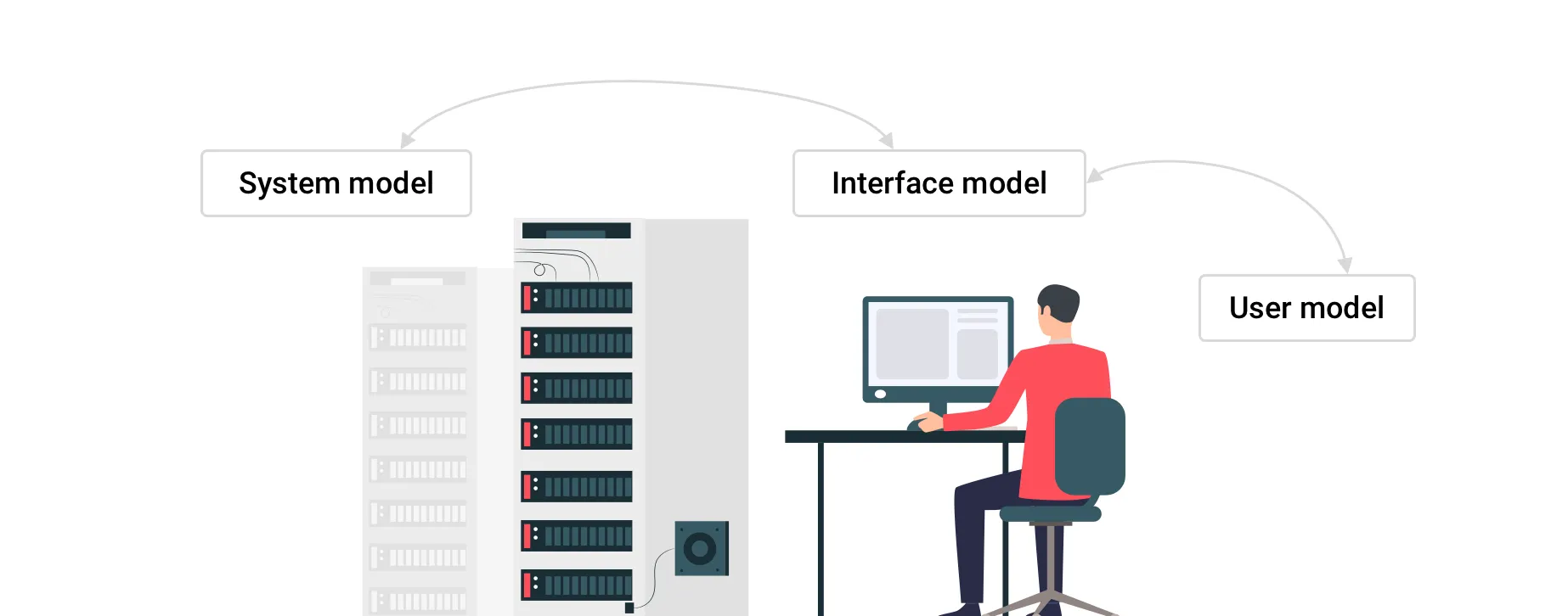
When designing UI, we should consider 3 models:
- System model — what the system really does
- Interface model — what the system presents to the user
- User model — what the user thinks the system does
System model ↔ Interface model ↔ User model
The heart of the interface model is communication.
The interface doesn’t need to expose all the internal workings of the system — it just needs to reflect the user’s mental model and show what the user needs.
For example, you want to call a friend.
- The user model is, “I just dial the number and press call.”
- The interface model gives you a dial pad and a call button.
- The system model, meanwhile, is doing far more under the hood (signal processing, network communication, etc.).
The UI doesn’t need to show all that complexity — it only needs to let you call your friend, and that’s enough.
Three key factors that help achieve good learnability
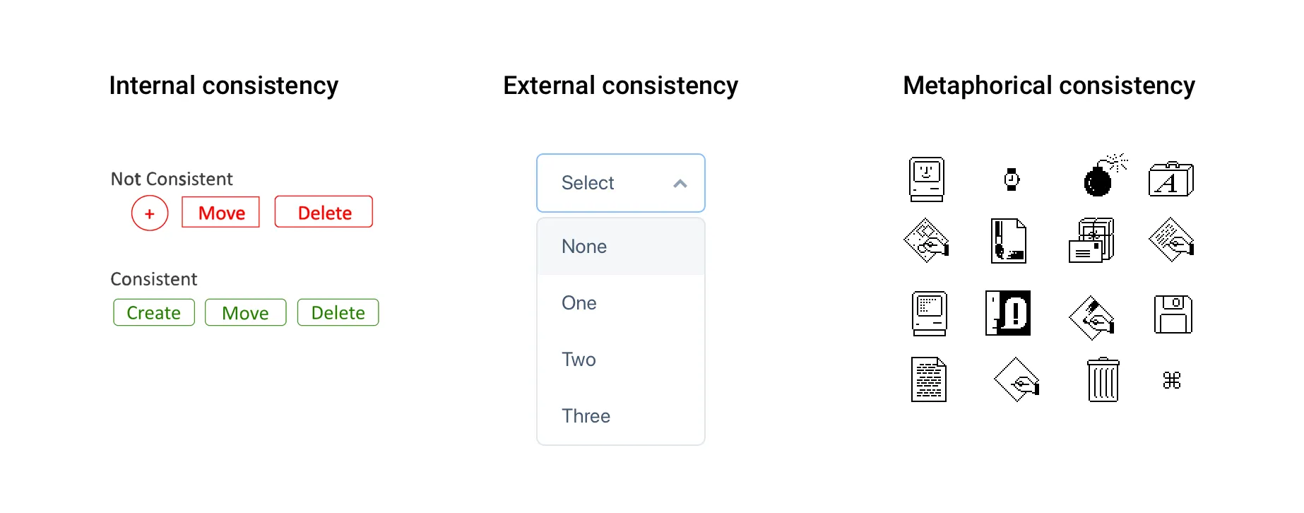
1. Consistency
The first important factor is consistency, or the Principle of Least Surprise — you shouldn’t surprise users with weird behavior. Consistency can be of 3 types:
-
Internal consistency — consistency within your own UI. Objects that behave similarly should look and act similarly. This also applies to language: if one page in your app uses the term “Express Delivery” but another says “Special Delivery,” users may wonder if they are the same.
-
External consistency — consistency with general UI conventions. Users often learn by pattern. For example, a downward arrow (▼) is commonly used to indicate a dropdown menu. If your interface also uses a downward arrow in an input field, users would expect it to behave as a dropdown menu.
-
Metaphorical consistency — consistency between your UI and real-world objects. Many interfaces mimic real-world objects — for instance, a “trash can” icon. These mappings help users understand quickly via real-world analogies. But you must use them judiciously, or they can backfire (e.g. IBM’s RealCD project is sometimes cited as a misstep).
2. Affordance

Affordance refers to clues about how an object is used — it helps the user know what can be done. These are important to communicate with the user and prompt action (i.e. call to action). For instance, the cursor changing shape tells you whether you can click or type. A good real-world example is door handles:
- A round knob suggests you twist
- A protruding handle suggests you pull or push
- A recessed grip might suggest a sliding door
If the UI’s appearance conflicts with its function, users may be confused about what to do.
3. Feedback
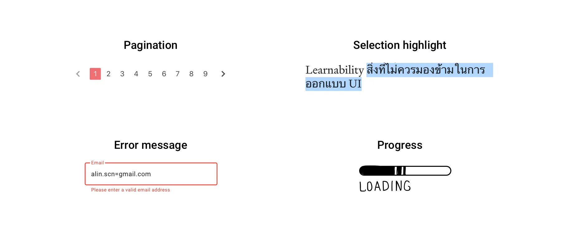
You should inform users about the system state or what’s happening. Imagine pagination that doesn’t indicate which page you’re on, or a payment button where you click “Pay” but nothing happens visibly — even though the system is processing. You might think the system broke. That’s bad UX.
Giving feedback is crucial — but it must be appropriate and clear, not overly noisy or confusing. Feedback that doesn’t explain what’s happening or what to do next is unhelpful or even annoying.

In Summary
When a user encounters a UI for the first time, there’s always cost — in time and effort. If we want to provide a good UX, we should minimize that cost by deliberately designing for learnability from the start.