Localization — Design That Truly Connects

If you’ve ever watched Inside Out, you may know that some scenes were changed depending on the country. Why did Pixar do that?
In the U.S. version, there’s a scene where Riley pushes away her broccoli. But in the Japanese version, Pixar swapped the broccoli for green peppers.
Director Pete Docter explained that the goal was to make sure the audience truly understood the emotion of the scene. Japanese children generally like broccoli, so using it would make the scene confusing. Green peppers, on the other hand, are widely disliked by Japanese kids — so the adaptation made the emotional message universal.
That small but meaningful change is a great example of localization: adapting an experience to fit the audience’s culture, context, and expectations so that communication feels natural.
Now, let’s look at localization through the lens of UI design.
Who is the end user?
Before designing anything, you must answer:
Who will be the end users of this?
Users from different countries, languages, and cultures interpret things differently. Localization goes beyond simply translating words — it adapts design and functionality to fit the needs of diverse users.
Localization ≠ Translation
Translation is only one piece of the puzzle. To truly localize, we need to consider many other elements that shape user experience.
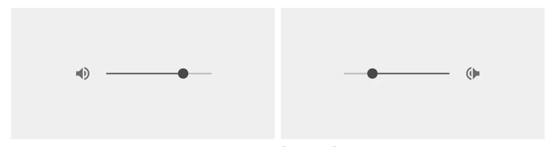
1. Reading direction
Not every language reads left to right. Arabic and Hebrew read right to left, while Chinese and Japanese can be written vertically, top to bottom. Reading direction affects layouts, alignment, and even arrow icons.
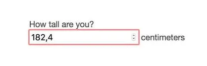
2. Different formats
- Dates: US uses MM/DD/YY format while the rest of the world mostly use DD/MM/YY format.
- Numbers: 23,400.50 (US) vs 23 400,50 (French) vs 23.400,50 (German)
- Ordering in general: Thai writing goes small → large. We use “first name" followed by "last name” and write addresses starting from "house number" to "city". In Korea it’s reversed. Koreans start their names with "last name" followed by "first name", and writes their addresses from largest geographic area to the smallest.
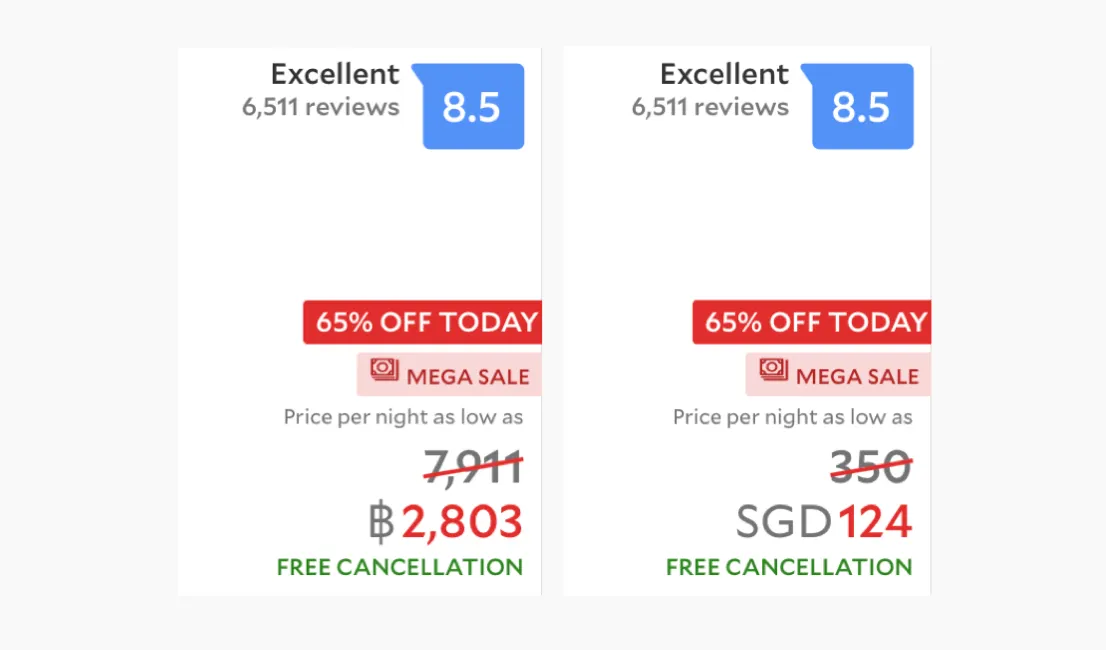
Currency and units
Booking platforms adapt prices and measurements to match the user’s location. For example, if you book from Thailand, the site will automatically show prices in Thai Baht (THB); if you’re in Japan, it will display Japanese Yen (JPY). This ensures users don’t have to mentally convert currencies while shopping or comparing prices.
The same principle applies to units of measurement. Distances might appear in kilometers in most of the world, but in the U.S. or the UK they may be shown in miles. Weight could be displayed in kilograms or pounds depending on locale, and even temperature can shift between Celsius and Fahrenheit.
Colors and icons
The choice of icons and colors requires careful consideration. The same color or icon may not carry the same meaning across countries. For example, in Chinese culture, the color red symbolizes luck and prosperity, while in other regions it can represent danger or negativity.
The same applies to metaphorical icons that reference everyday objects — because those objects themselves may look different or hold different associations in each culture.
Case study: AbuHakim
At SparkLabs Demo Day 13 in Seoul, the startup AbuHakim showcased how localization can make or break a product.
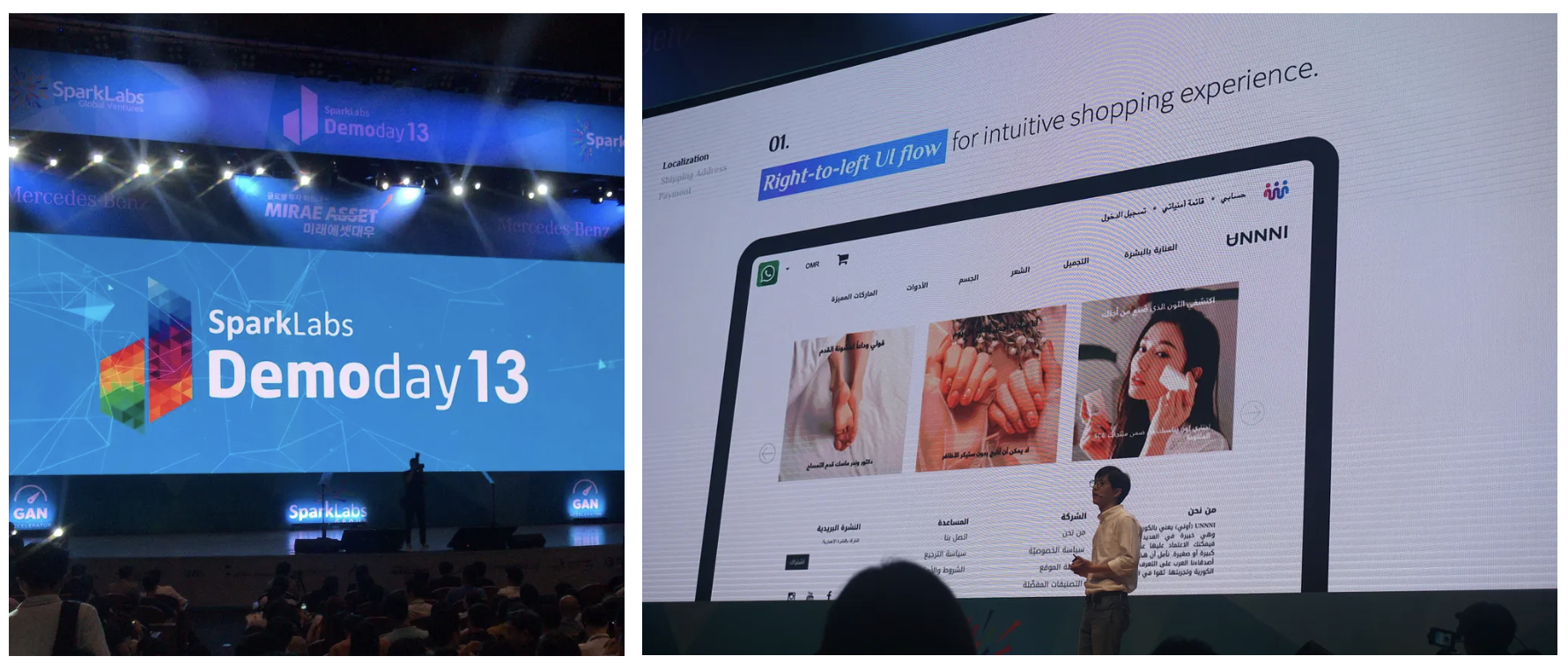
AbuHakim's goal was to connect Korean products with customers in the Middle East by building a commerce platform that actually fit the local users.
They found that many global e-commerce platforms failed because they ignored localization:
- Language & direction — They adapted UI for right-to-left languages and even moved the shopping cart from the top right to the top left.
- Address entry — Many customers don’t use strict address formats. Instead, they write directions conversationally (e.g., “opposite building A”). So the platform redesigned its forms to allow narrative inputs.
- Payment — While credit cards exist, many still prefer “cash on delivery.” AbuHakim made COD a first-class option.
This deep adaptation led to much higher adoption compared to platforms that only “translated” their interface.
Takeaway
Localization is about making digital products feel natural and usable to people in their own cultural context. It involves:
- Translation with cultural nuance
- Supporting reading direction
- Adapting formats (dates, numbers, addresses)
- Handling currency & units
- Choosing colors & icons appropriately
But the most important step is always the same: Who is the end user? As usability expert Jakob Nielsen put it:
One of usability’s most hard-earned lessons is that you are not the user.